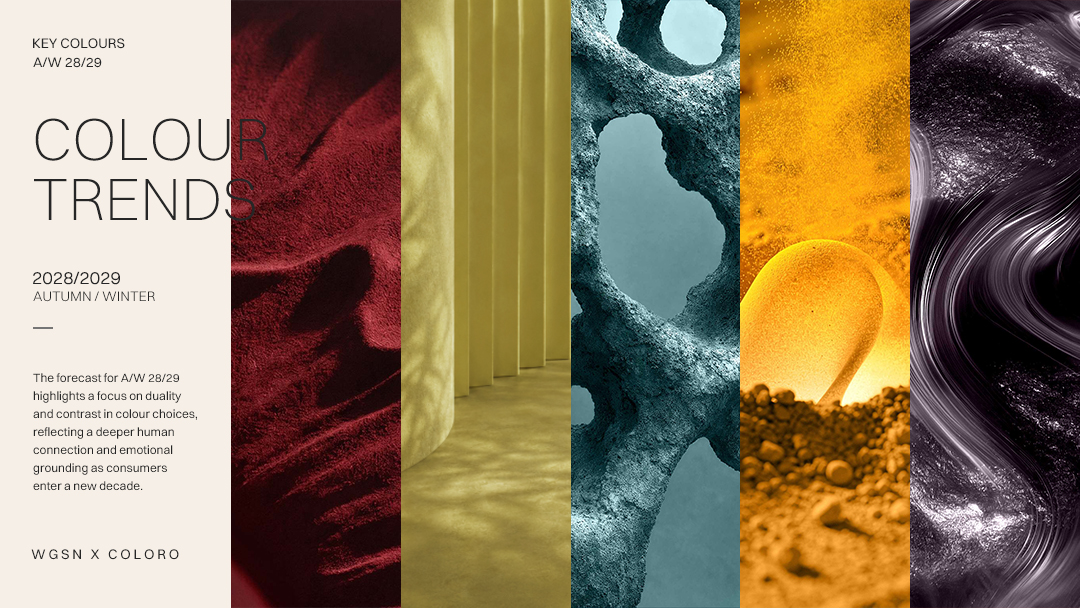
The five Key Colors for A/W 28/29, released by global trend forecaster WGSN with the color system Coloro, are built on duality and intentional contrast — reflecting consumers' search for deeper human connection and emotional grounding as they cross the threshold of a new decade, and answering a growing appetite for sincerity, longevity, and emotional ROI.
Highly versatile and trans-seasonal, the palette adapts across contrasting pairings and takes on shifting personalities. From Bloodstone — a symbol of life force and sincerity — to the mystical calm of Smoky Amethyst, these five hues will shape industries through A/W 28/29.
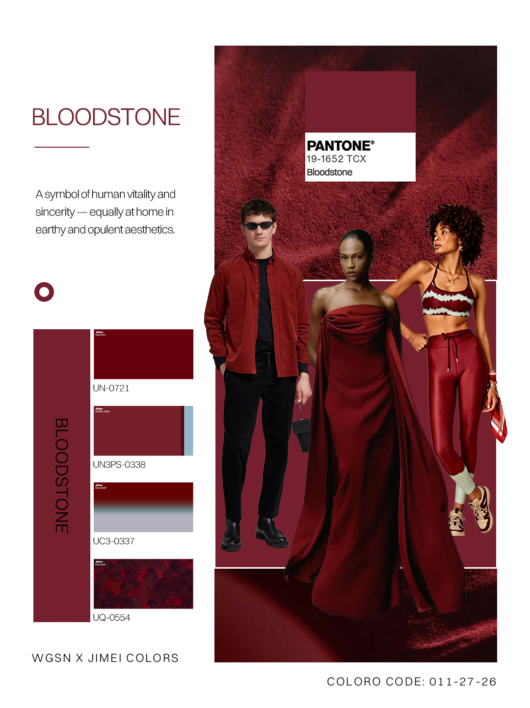
◉ Bloodstone
Color Strategies
● Leverage this hue to convey sustained human energy and aliveness, evolving beyond digital slickness toward a color with deep, consequential relevance.
● Versatile across both earthy and opulent aesthetics — on cellulose acetate sheet, Bloodstone reads as genuine human craft.
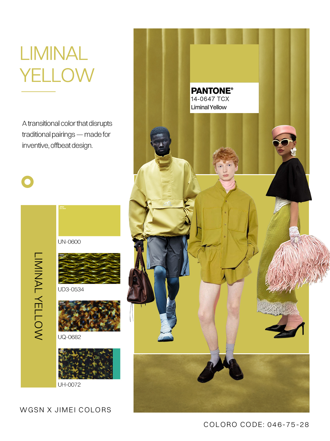
◉ Liminal Yellow
Color Strategies
● Its hazier, grittier quality acts as a counterbalance to sensory overstimulation and to the intensity of S/S 28 Positively Yellow in this new season.
● On cellulose acetate sheet, it delivers a lived-in, nostalgia-tinted look and feel.
◉ Elemental Verdigris
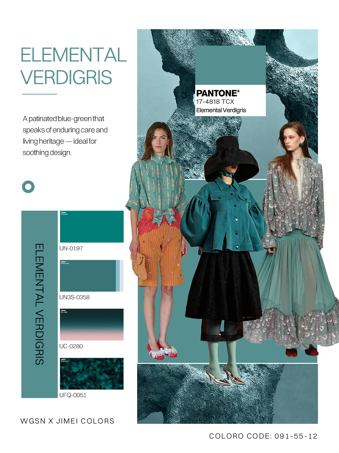
Color Strategies
● Its elemental and calming qualities make it perfectly suited to products that aim to visually soothe.
● Appealing to both natural-dye narratives and soft-tech aesthetics, it achieves unique piece-to-piece variation on acetate sheet — distinctly human, unpredictable qualities.
◉ Healing Turmeric
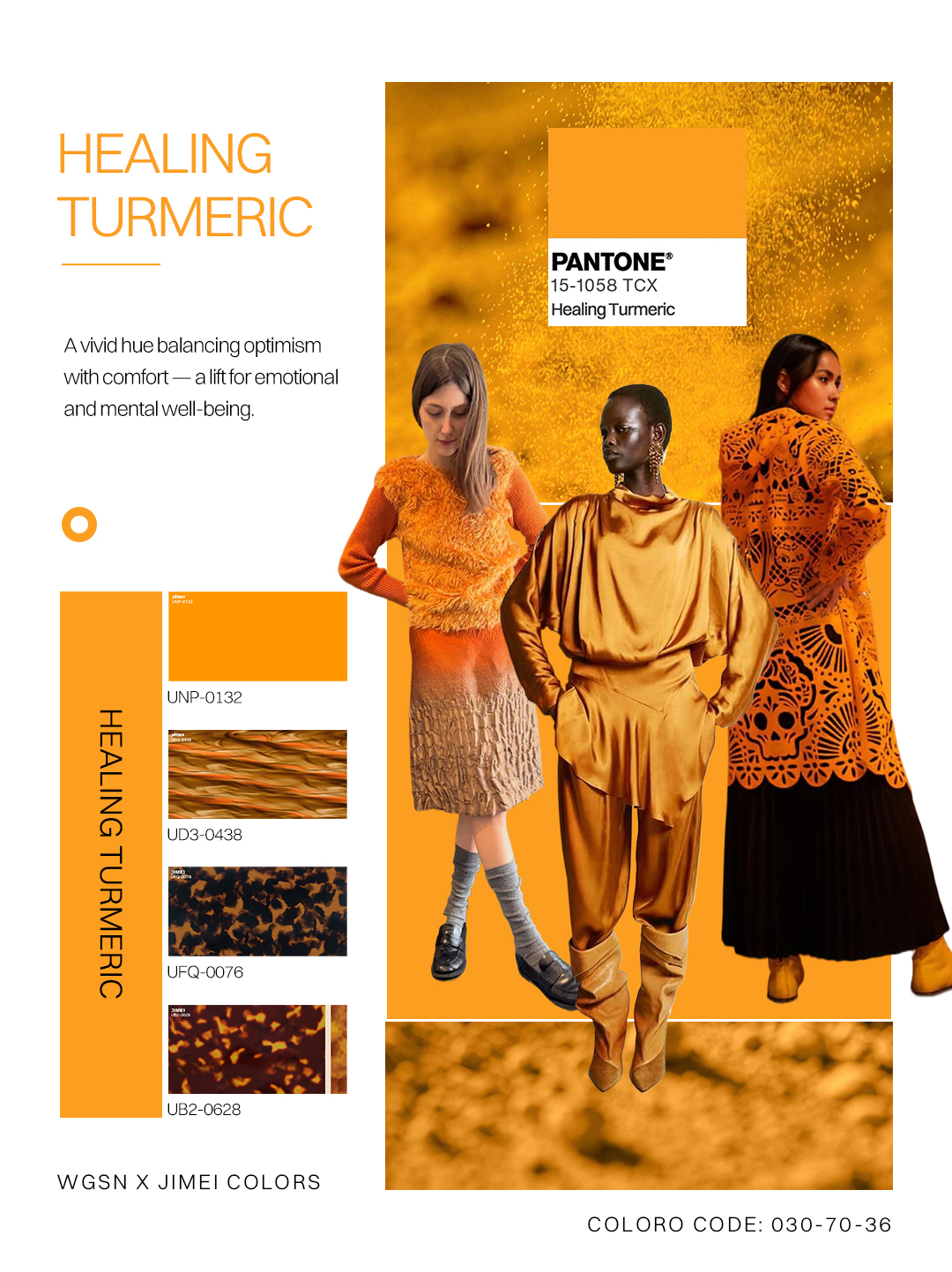
Color Strategies
● Its deep spiritual and cultural relevance makes it perfectly suited to healing and ritual-dedicated products.
● Versatile across heritage craft and tech-forward aesthetics — applied to translucent acetate, it conveys a sense of contemporary glow and emotional balance.
◉ Smoky Amethyst
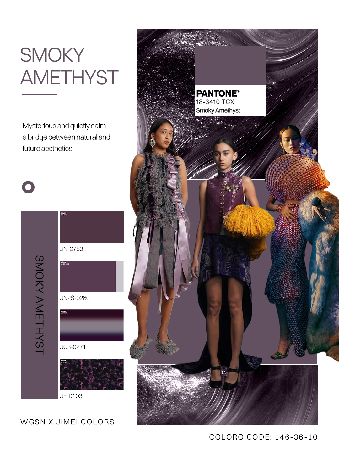
Color Strategies
● Rooted in artisanal craft, it achieves unique variation across soft and hard materials.
● A premium-leaning shade — on acetate sheet it softens every surface, opening a deeply spiritual, luxurious brand narrative.
STRATEGIC APPLICATION
- Making color land in the real world -
Without ever shouting
◆ Lead with emotional resonance and stability — so color becomes the bridge to how consumers feel inside.
◆ Put materiality and texture centre stage: deepen the bond with color through touch as much as sight.
◆ Balance functional stability with intentional delight in your color strategy.
MARKET IMPACT
- From emotional resonance to long-term investment -
◆ Bloodstone and Healing Turmeric — deep in emotional and cultural resonance — read as long-term investment colors.
◆ Liminal Yellow and Elemental Verdigris serve both neutral styling and the digital-forward market.
◆ Smoky Amethyst is positioned as a versatile, low-risk alternative to conventional darks.
RISKS & CONSIDERATIONS
- Keeping a trend from stopping at trend -
Finding the balance between retro and future
◆ Reframe retro elements through modern narratives of visible care and longevity, rather than chasing nostalgia for its own sake.
◆ Keep visual breathing room in high-contrast pairings so the design still reads future-facing.
◆ Choose color deliberately — to evoke human qualities and emotional connection, not surface effect.
Taken as a whole, the forecast makes one thing clear: color chosen with intent — to evoke human qualities and emotional connection — sets a transformative tone for A/W 28/29.
Five colors, five emotional grounds.
For A/W 28/29, let color return to its source: sincerity, longevity, and emotional ROI.
——
WGSN × COLORO · JIMEI COLORS